Byte Friendly

Random thoughts on programming and related topics.

DIY: Funnel Chart

| Comments

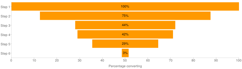
Recently I came across this excellent way of visualizing a funnel. It’s simple, informative and it doesn’t look like a freaking funnel (with neck and all).

link to source

The only negative property of it is that it’s implemented with Google Charts API. Sure, it’s free and pretty, but it’s also an external service call and a dependency. Today I’ll show you how to make this kind of charts yourself in your charting library (I’ll be using highcharts.js).

This can be done with any charting library that supports stacked bar charts. Because that’s what it is, a stacked bar. The trick is that one of the stack parts is invisible and serves as a padding. Look:

link to source

You see, the basic idea is pretty simple. The only hard part is to translate into series of commands to your charting lib. I have made a small function for myself that does creates a series for highcharts:

1
2
3
4
5
6
7
8
9
10
11
12
13
14
15
16
17
18
19
20
21
22
23
24
25
26
27
28
29
30
31
32
33
34
35
36
37
38
39
40
41
var makeSeriesConfig = function (values) {
    // we need max value to calculate padding correctly
    var max_value = null;
    values.forEach(function (v) {
        if (!max_value || max_value < v.value) {
            max_value = v.value;
        }
    });

    var padding = {
        name: 'padding',
        dataLabels: {
            enabled: false // don't show labels for padding
        },
        data: [] // will fill later
    };

    var centralPiece = {
        name: 'Value',
        data: [], // will fill later
        dataLabels: {
            enabled: true,
        }
    }

    values.forEach(function (v) {
        var w = (max_value - v.value) / 2;
        padding.data.push({
            y: w,
            color: 'white' // background color
        });

        centralPiece.data.push({
          y: v.value,
          name: v.name
        });
    });


    return [centralPiece, padding]
};

Later we use this function in a chart definition:

1
2
3
4
5
6
7
8
9
10
11
12
13
14
15
16
17
var chart;
$(document).ready(function () {
    chart = new Highcharts.Chart({
        chart: {
            renderTo: 'container',
            type: 'bar'
        },
        // ... other options go here ...
        series: makeSeriesConfig([
                                    {name: 'Step 1', value: 300},
                                    {name: 'Step 2', value: 240},
                                    {name: 'Step 3', value: 70},
                                    {name: 'Step 4', value: 40},
                                    {name: 'Step 5', value: 10}
                                ])
    });
});

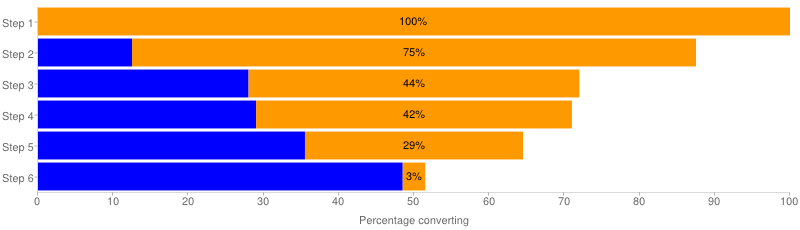
Here’s my final result which I’m happy with and which is going from proof-of-concept to active development.

Final result

Comments